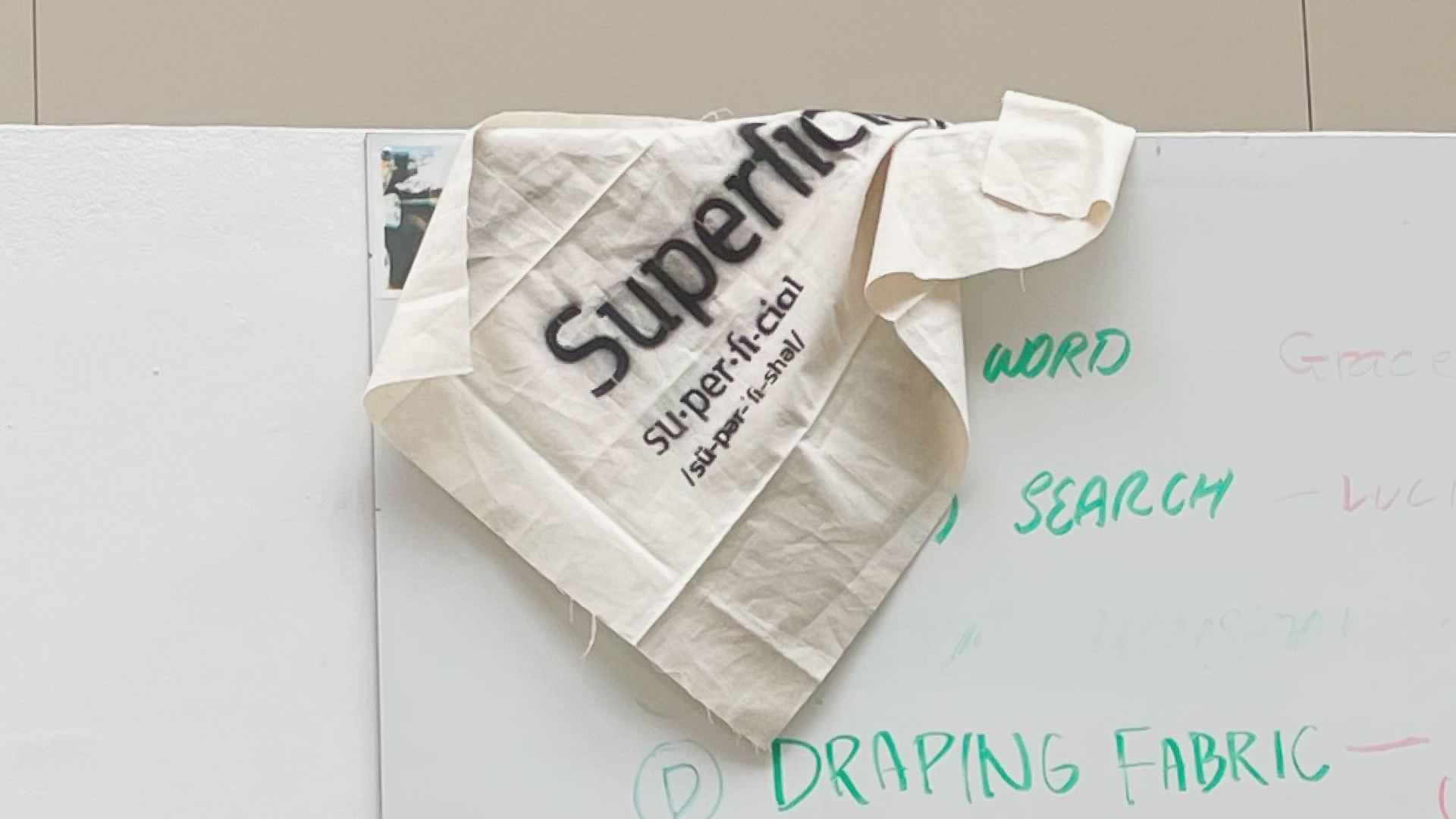
Superficial
“What do we make out of the surface level?”
—Duration: 2 months
—Scope: Exhibition Design, Identity System
—Tools: Figma, Indesign, and lots of fabrication
—Collaborators: Public Noodle (Andrea Manrique, Grace Cao, Julie Du)
—Awards: Young Ones 2026 Finalist (x2)
Branding Systems / Identities (ADC)
Environmental Design / Installation (TDC)
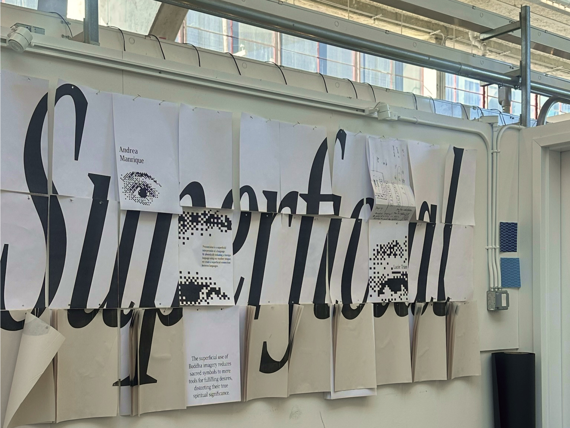
Superficial is an exhibition identity design created for CCA's Spring 2025 senior show. Responding to the theme Superficial, the exhibition centered on the idea of searching for meaning among surface-level fragments.
Through mass-produced materials, fragmented type, and pixelated imagery, the identity embraces a disposable aesthetic that reflects the fractured way we encounter information. Each element offers only a partial view—inviting the audience to step back, piece things together, and question what lies beneath the surface.
Process
Conceptual Stage
We initially explored 3 primary directions—
1. Surface as visual texture
Design was centered around spray-painting on fabric, inviting the audience to look only at the texture of the surface.
2. Searching for meanings among the superficial
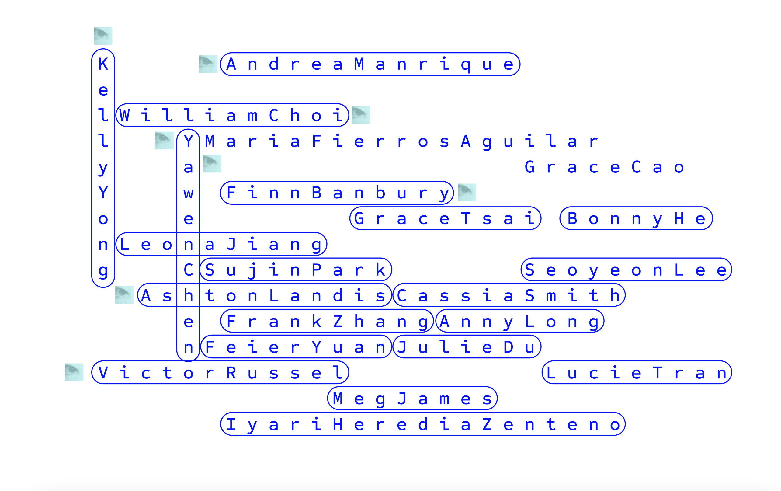
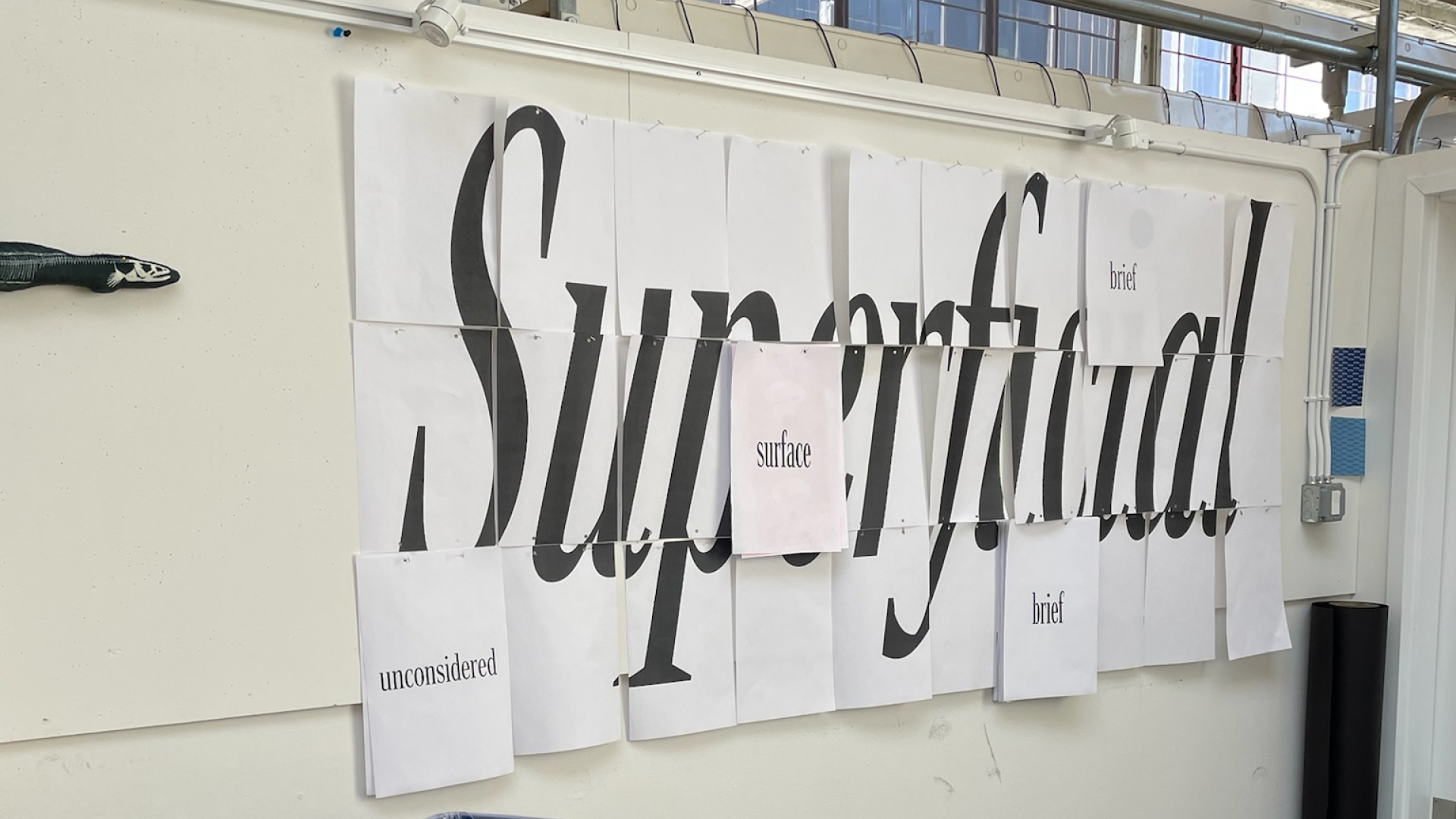
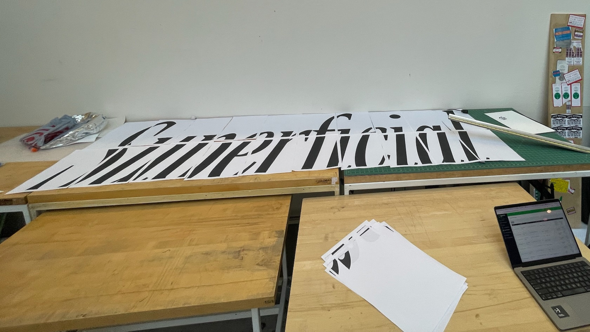
A gigantic word puzzles, inviting the audience to stay engaged and look closely for meaningful pieces.
3. Superficiality as abstraction
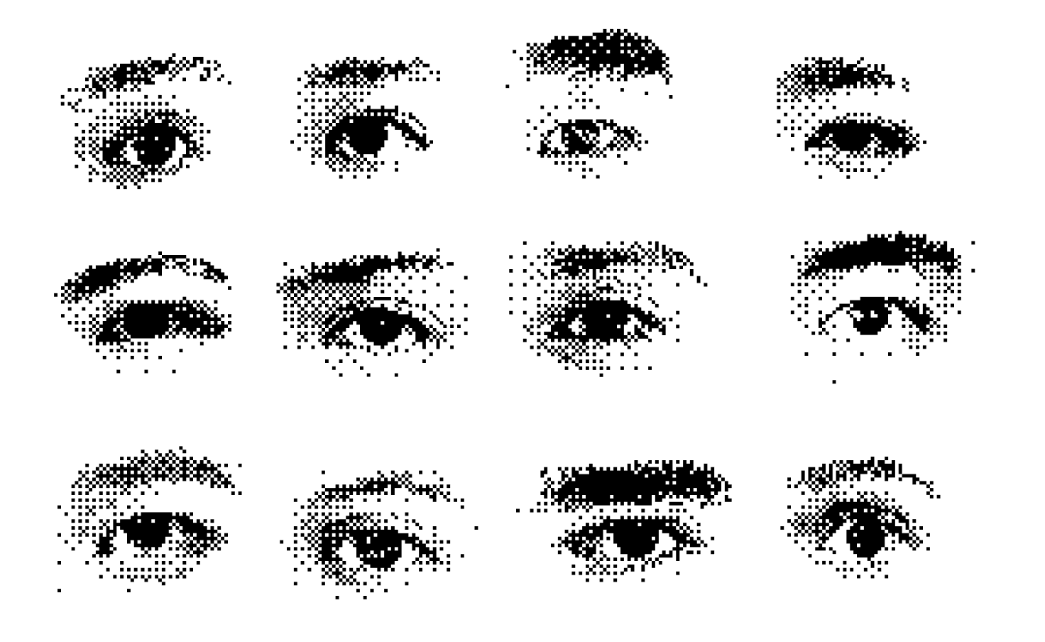
Focusing on the abstraction of facial features, questioning whether looking closer at the surface make things clearer or more complex?
Assembly Stage
This phase was the time to work on other applications of the exhibition, while making sure everything ties back to the original concept. We then expanded the identity design in the following ways:
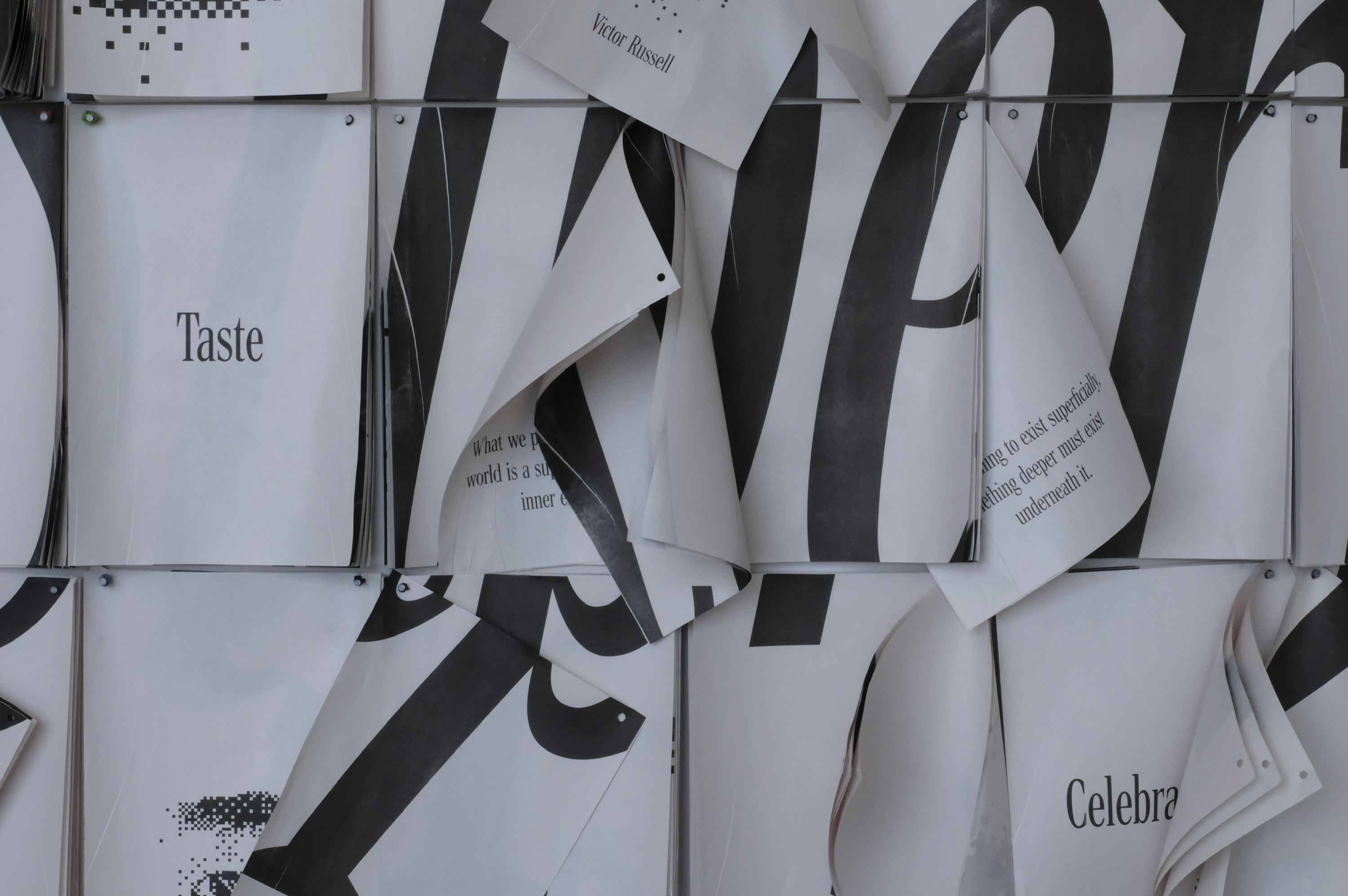
1. Abstraction
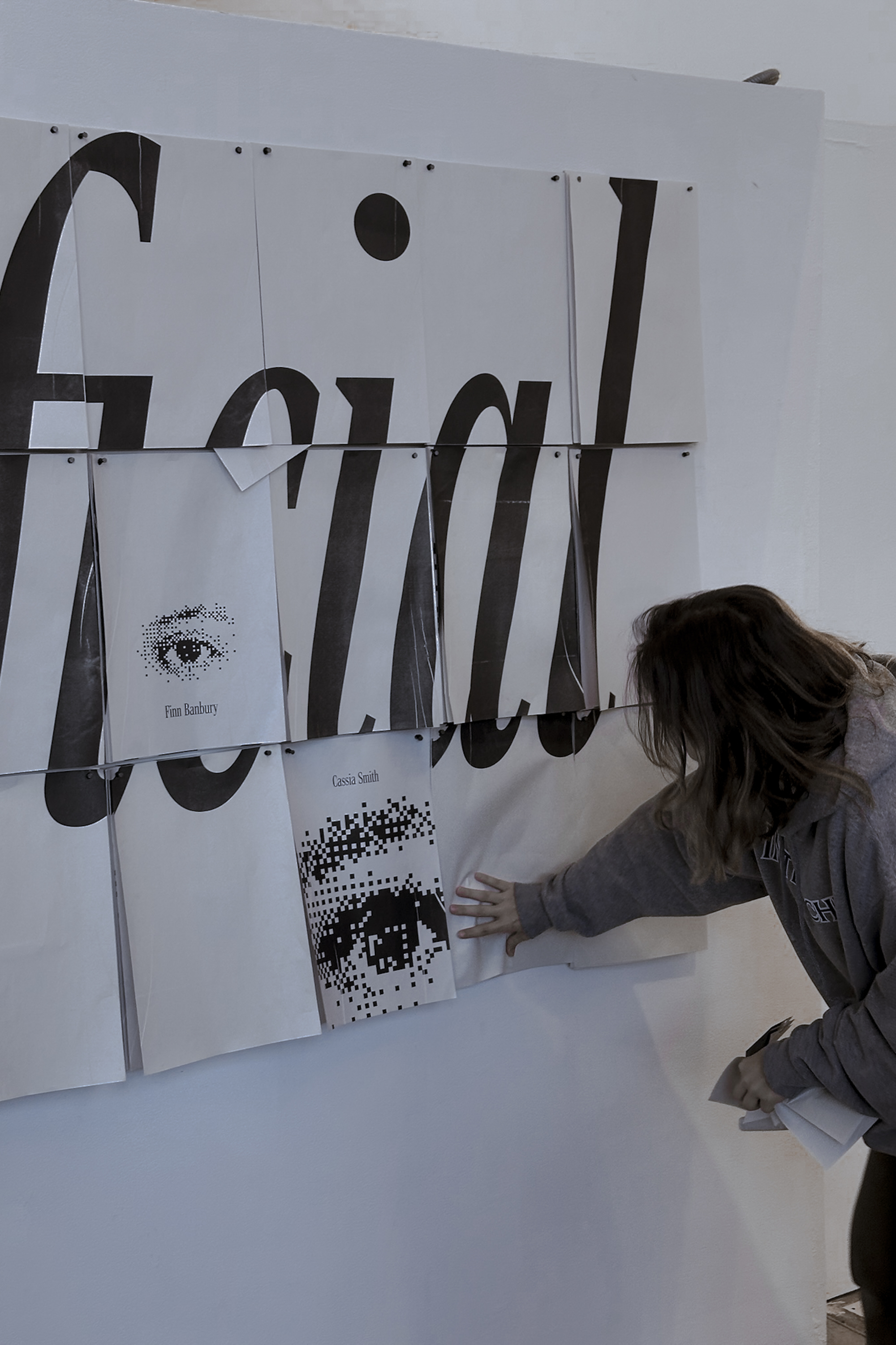
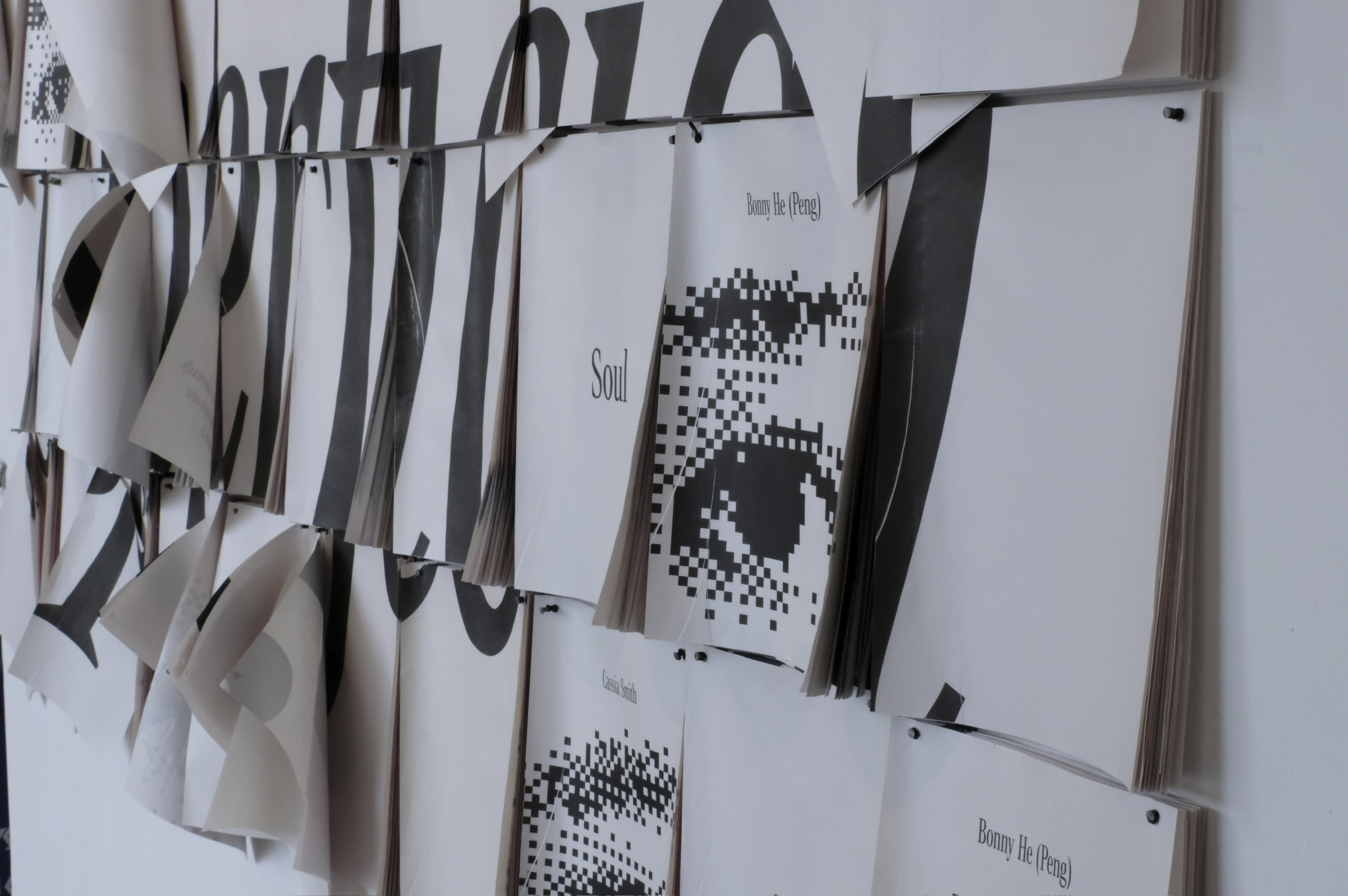
We revived the pixelated eyes idea, incorporating participants’ eyes and thesis keywords hidden among the stacks of the Superficial wall.
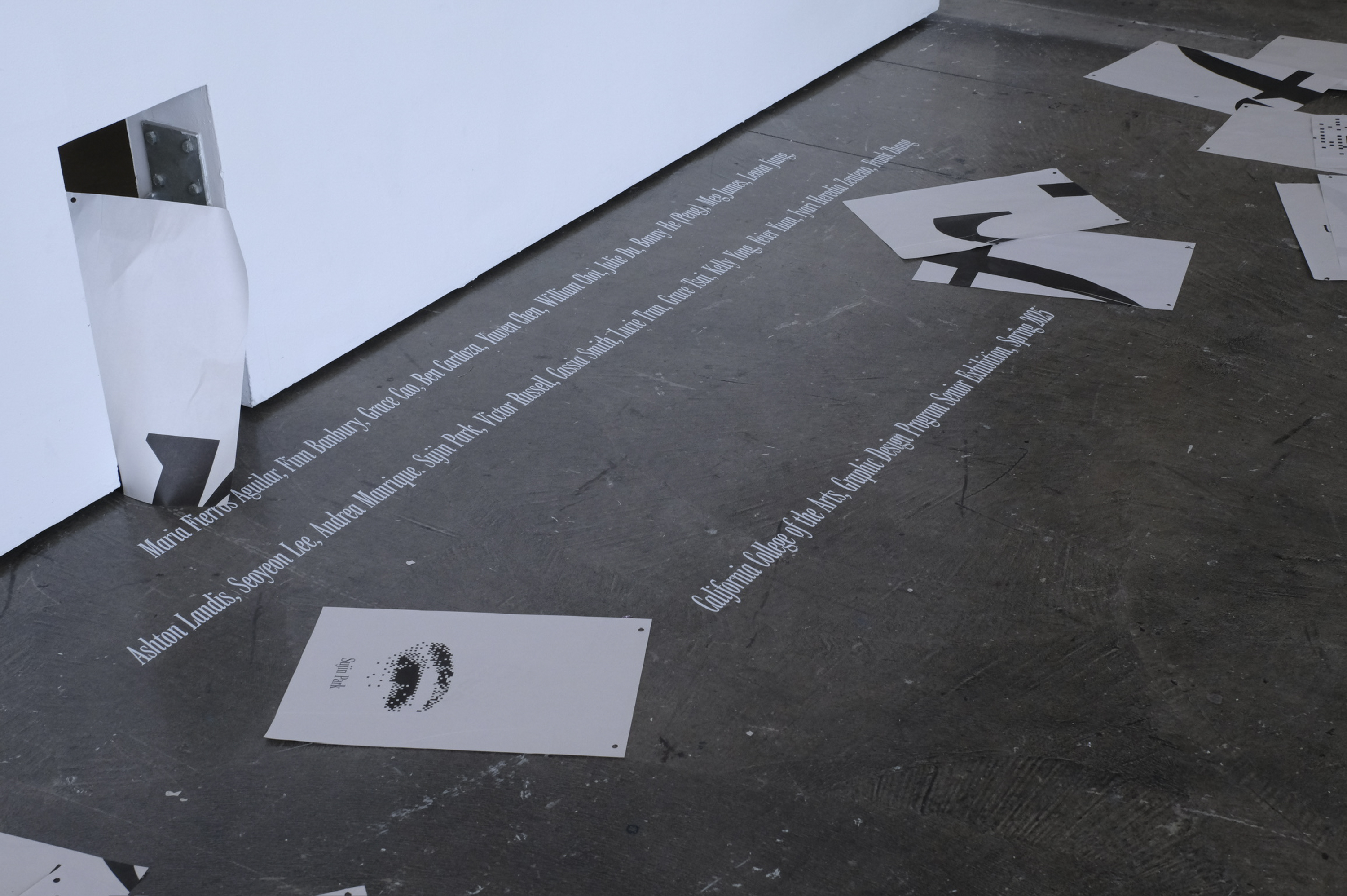
2. Exhibitors' Names
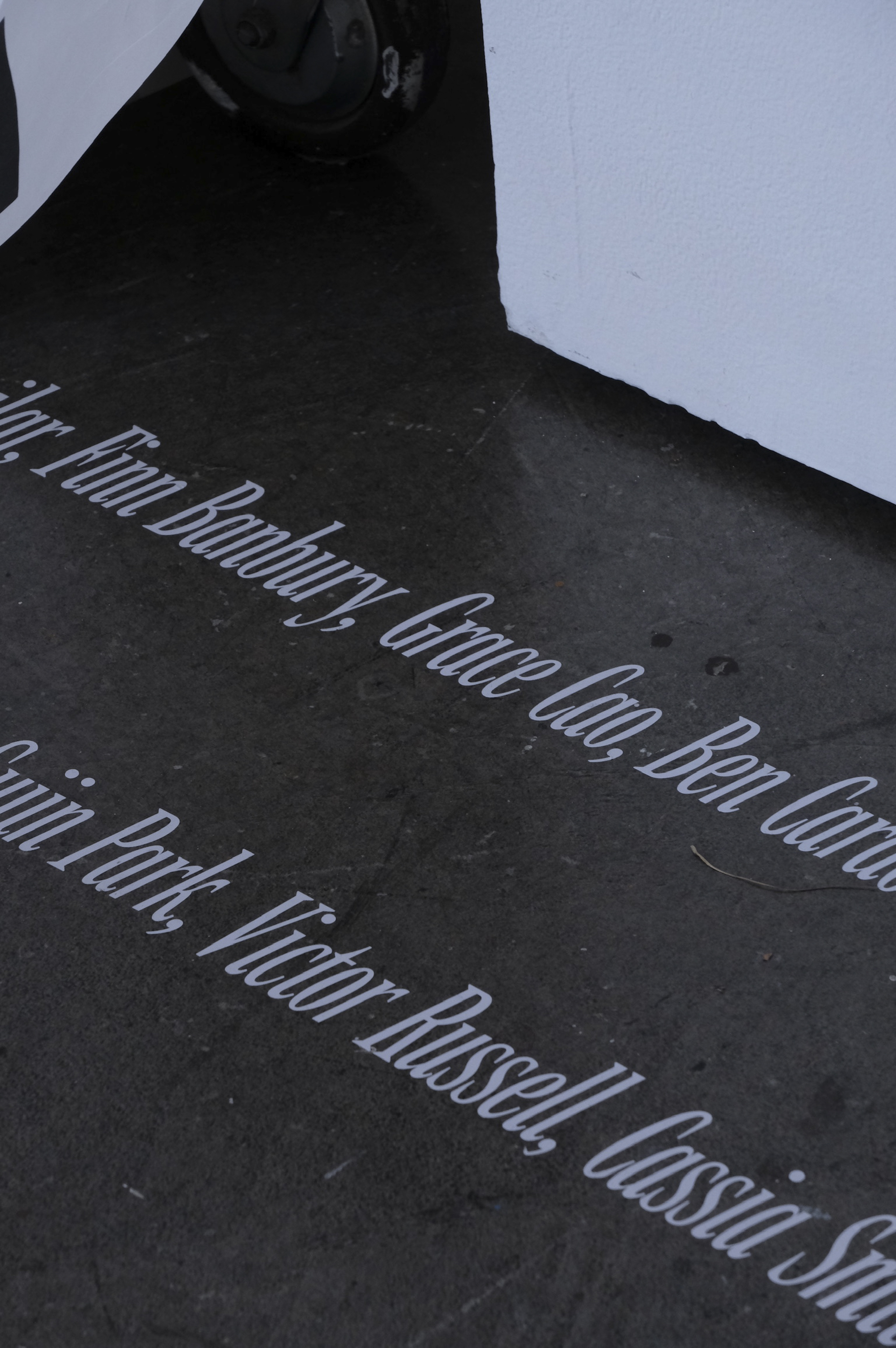
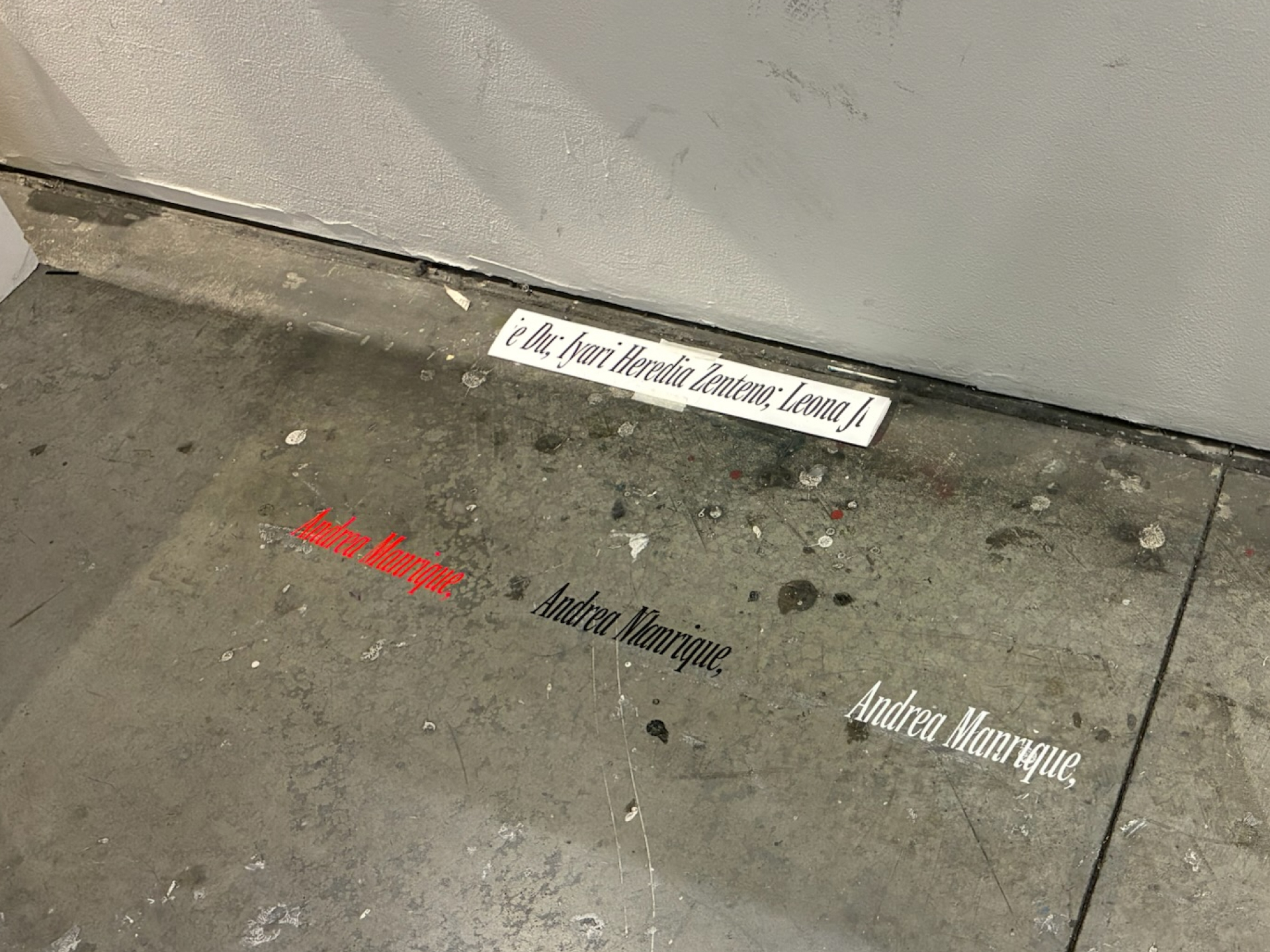
Participant names were applied as white vinyl italics directly on the floor in front of the wall—subtle enough that people might step over them without noticing.
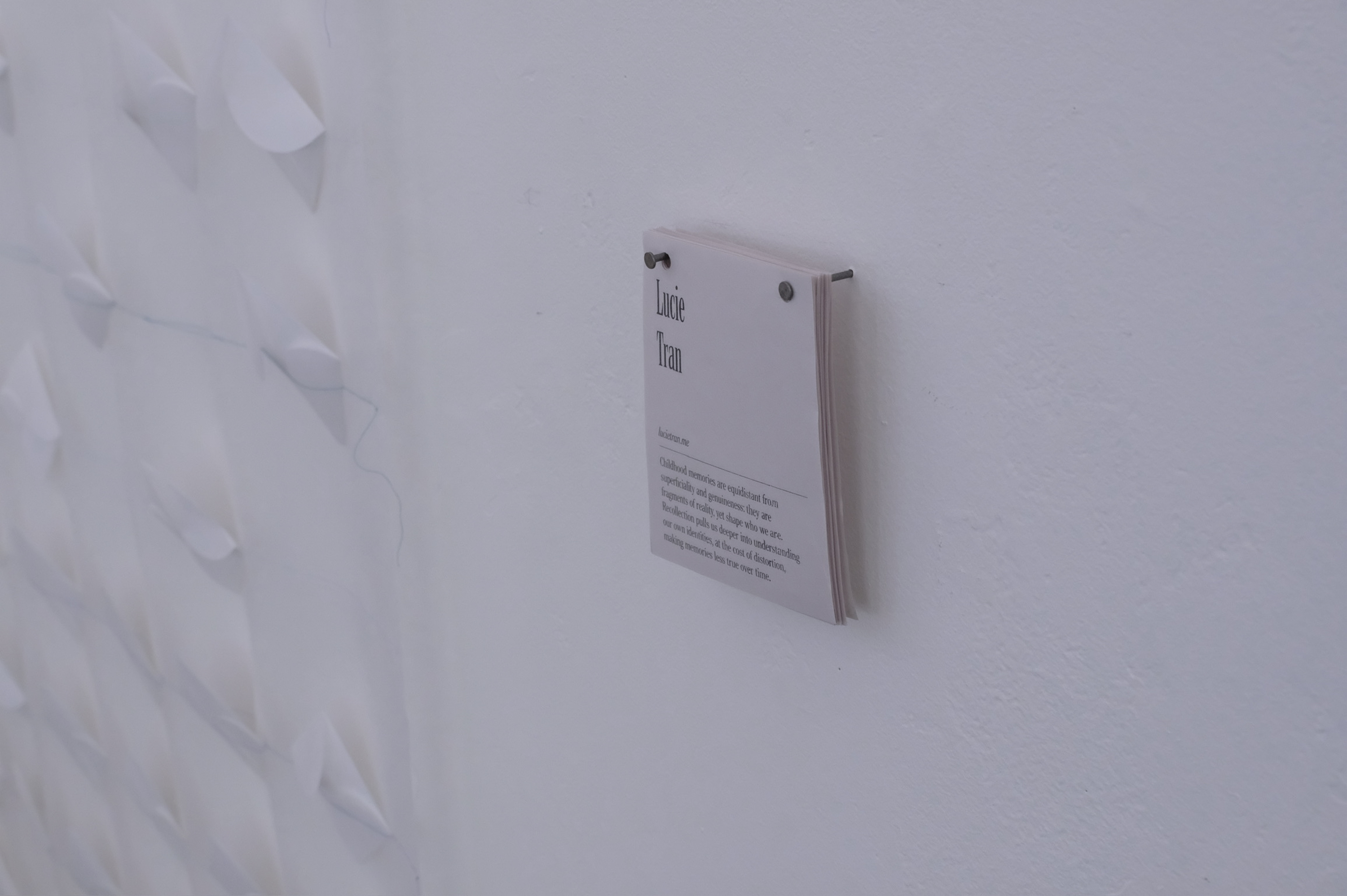
3. Name Tags
Name tags were riso-printed on smaller newsprint sheets, stacked and hung beside each person’s work.
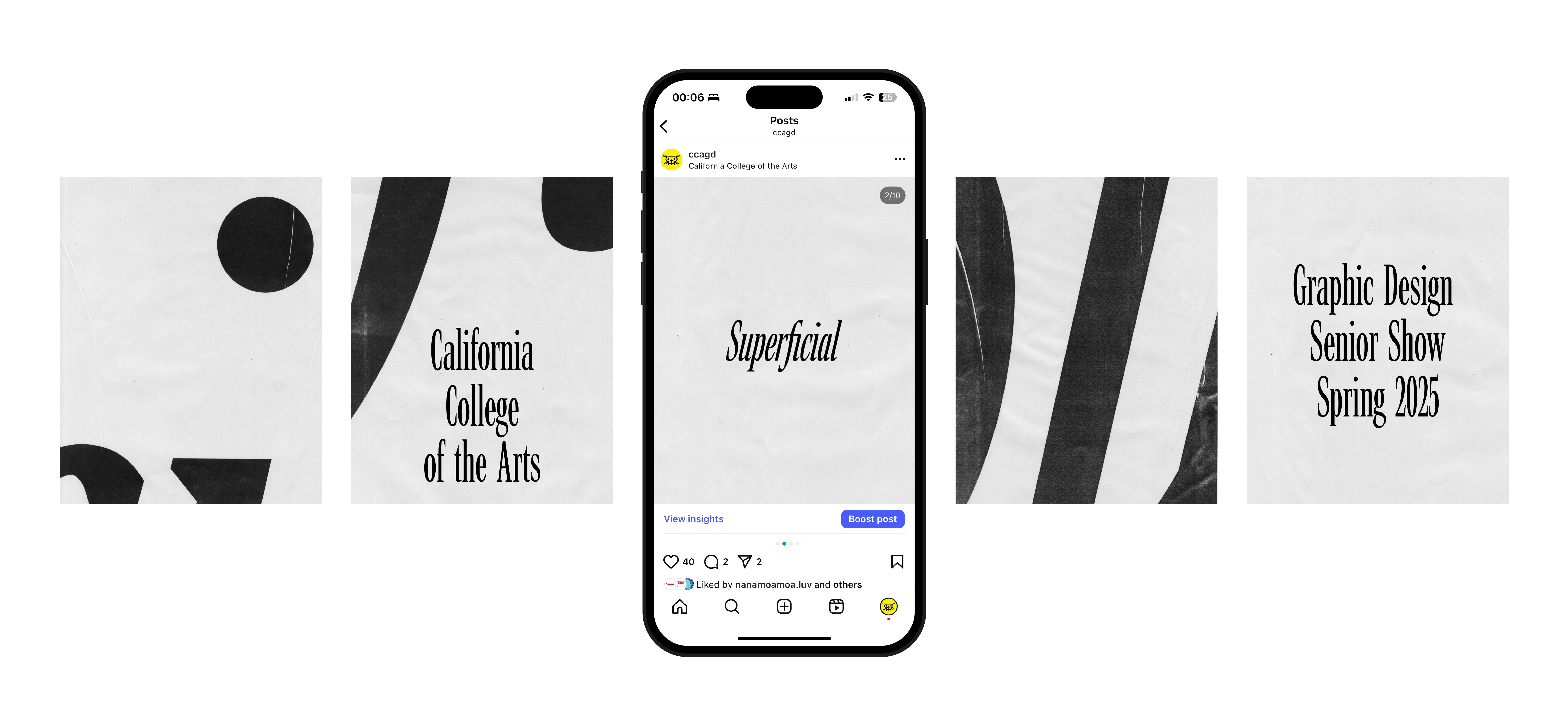
4. Social Media
We scanned actual prints from the wall and overlaid information in the same style and scale as the participant names, mirroring the physical installation.
Assembly Stage
The most chaotic and exciting part of our process was this. Words cannot describe this so here's a time-lapse compilation :-)
Superficial
“What do we make out of the surface level?”
—Duration: 2 months
—Scope: Exhibition Design, Identity System
—Tools: Figma, Indesign, and lots of fabrication
—Collaborators: Public Noodle (Andrea Manrique, Grace Cao, Julie Du)
—Awards: Young Ones 2026 Finalist (x2)
Branding Systems / Identities (ADC)
Environmental Design / Installation (TDC)
Superficial is an exhibition identity design created for CCA's Spring 2025 senior show. Responding to the theme Superficial, the exhibition centered on the idea of searching for meaning among surface-level fragments.
Through mass-produced materials, fragmented typography, and pixelated imagery, the identity embraces a disposable aesthetic that reflects the fractured way we encounter information. Each design element offers only a partial view—inviting the audience to step back, piece things together, and question what lies beneath the surface.
Process
Conceptual Stage
We initially explored 3 primary directions—
1. Surface as visual texture
Design was centered around spray-painting on fabric, inviting the audience to look only at the texture of the surface.
2. Searching for meanings among the superficial
A gigantic word puzzles, inviting the audience to stay engaged and look closely for meaningful pieces.
3. Superficiality as abstraction
Focusing on the abstraction of facial features, questioning whether looking closer at the surface make things clearer or more complex?
Expansion Stage
Each of our initial ideas had a flaw, but we moved on with the 2nd direction. We envisioned a title wall of stacked newsprints forming the word Superficial, each holds a designer’s name and word puzzle.
However, due to time constraints, it became too complicated to create multiple versions of puzzles. Instead, we embraced the idea of multiples: cheap, riso-printed sheets that could be taken, discarded, or pieced together—fragments that only made sense as a whole.
Assembly Stage
This phase was the time to work on other applications of the exhibition, while making sure everything ties back to the original concept. We then expanded the identity design in the following ways:
1. Abstraction
We revived the pixelated eyes idea, incorporating participants’ eyes and thesis keywords hidden among the stacks of the Superficial wall.
2. Exhibitors' Names
Participant names were applied as white vinyl italics directly on the floor in front of the wall—subtle enough that people might step over them without noticing.
3. Name Tags
Name tags were riso-printed on smaller newsprint sheets, stacked and hung beside each person’s work.
4. Social Media
We scanned actual prints from the wall and overlaid information in the same style and scale as the participant names, mirroring the physical installation.
Installation Stage
The most chaotic and exciting part of our process was this. Words cannot describe this so here's a time-lapse compilation :-)
.png)