Atlas
“How can living languages be captured in a fixed form?”
—Duration: 1 month
—Scope: Editorial Design, Book Binding
—Tools: Indesign, Photoshop, lots of crafting
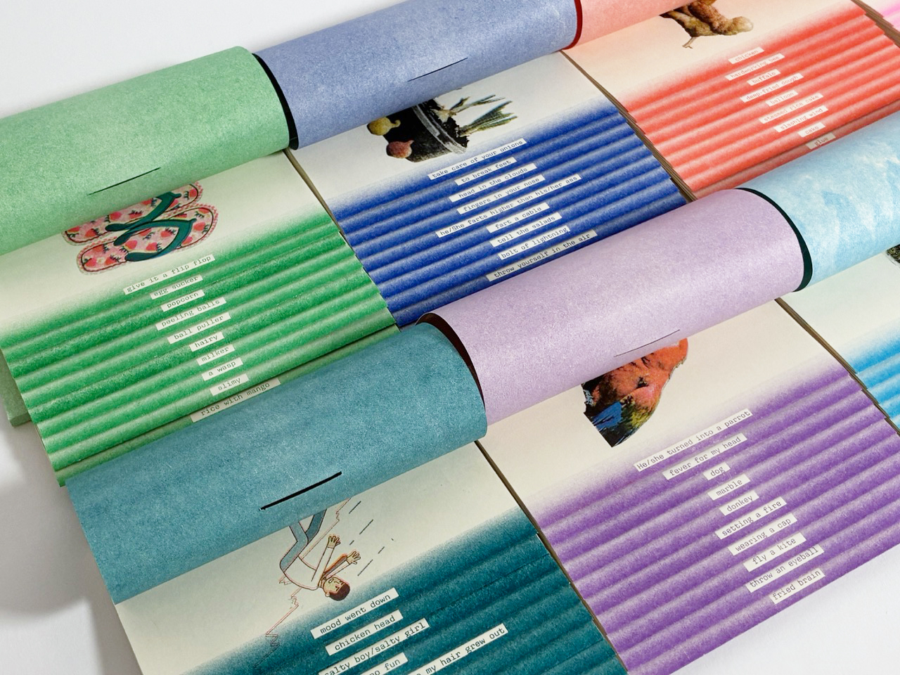
Atlas is an ever-growing series of riso-printed books, mapping the living edges of language: slangs, inside jokes, and internet-born phrases.
The series was inspired by traditional glossaries, which often prioritize density, compressing language into static forms that can’t keep pace with how languages evolve. Atlas was created to push back that notion by pairing each slang with collaged imagery that interprets words at their most literal and absurd form.
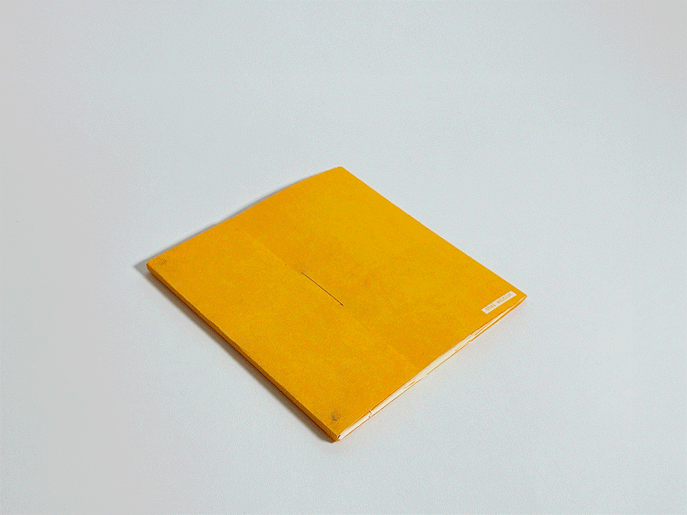
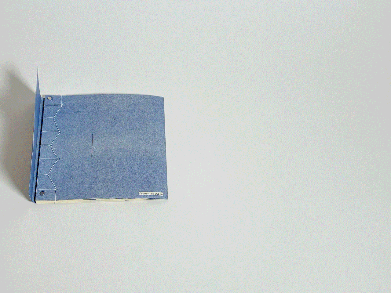
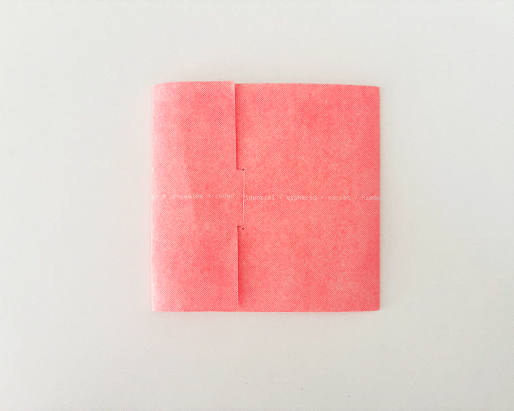
Each volume is hand-sewn using Japanese stab binding and embedded with magnets, allowing the series to physically connect and evolve.
Process
Initial Ideas
Atlas began as a single book, in response to a prompt: make a book about code. Instead of approaching code as syntax, the project expored slangs as coded messages. These expressions rarely describe meanings directly, but operate through distortion and shared context.
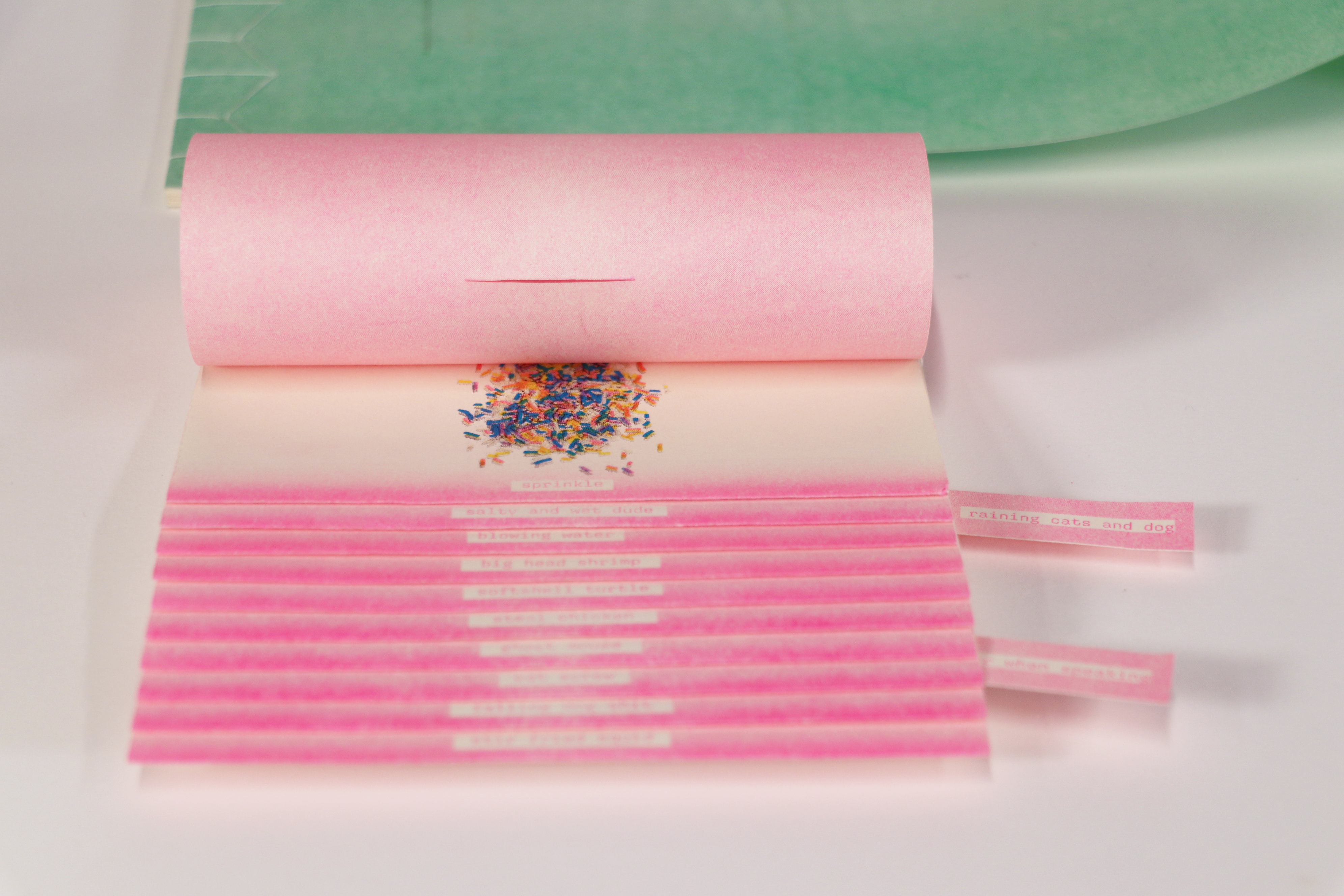
To explore this, each phrase was translated into its more literal and absurd visual form through collages. Existing stock photos were cut and reassembled to make strange but interesting imagery.

Design & Prototype
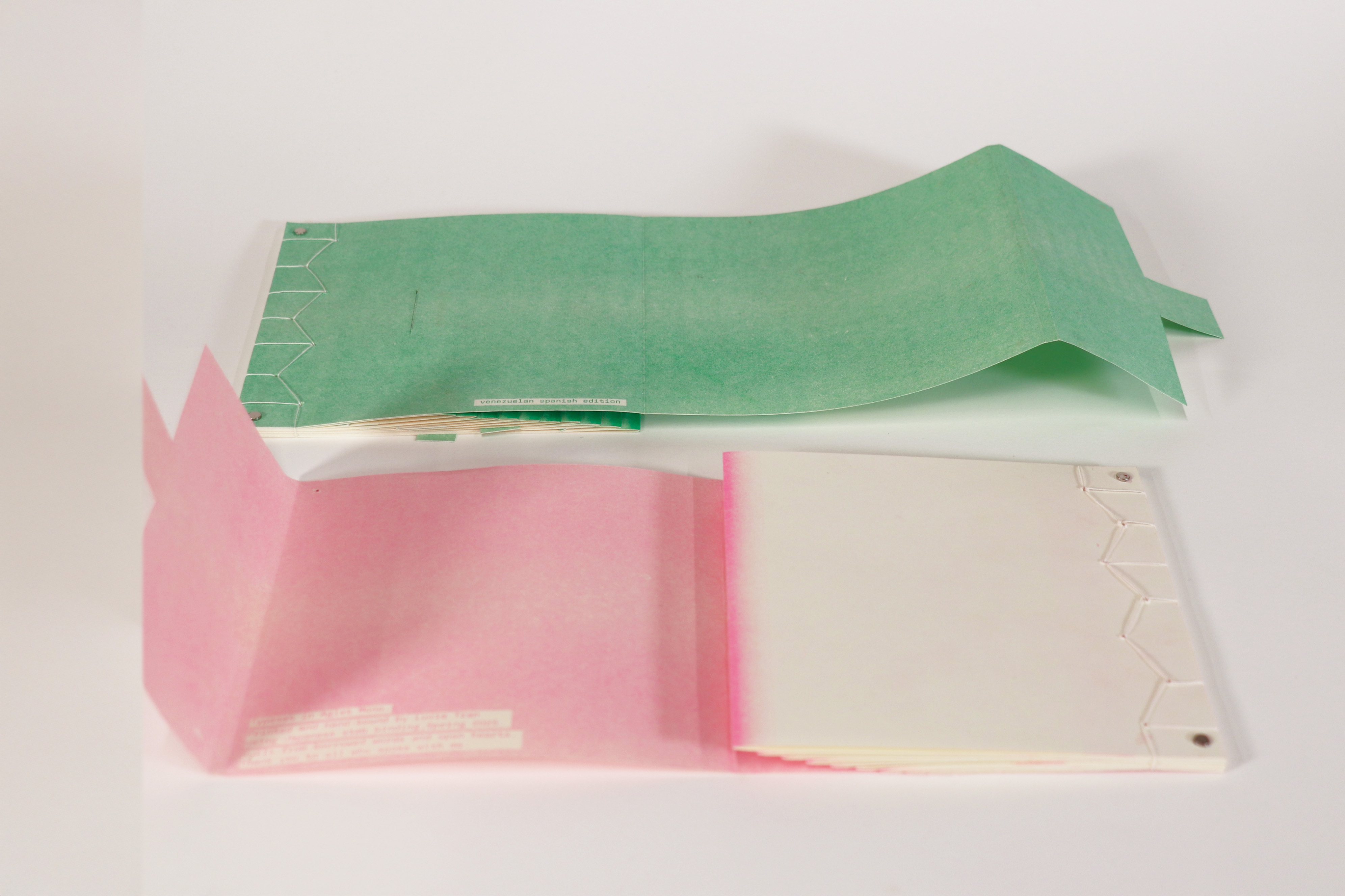
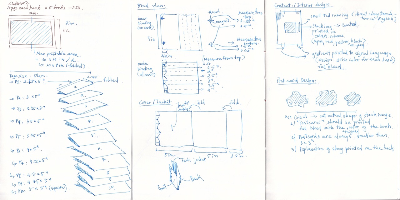
Japanese stab binding was chosen to conceal content between layers. Risograph introduced texture, misregistration, and saturated colors, reinforcing the playfulness of imagery. The staircase structure was created as a spatial metaphor for layers of language.
With this binding structure, each page brings a layered reading experience: the literal interpretation appears first, followed by its literal visual, then the actual meaning is tucked deep within the page. The publication intentionally avoids a grid system. Instead of imposing order, elements are allowed to float on the page to reflect the unstructured nature of contemporary language.
Expansion
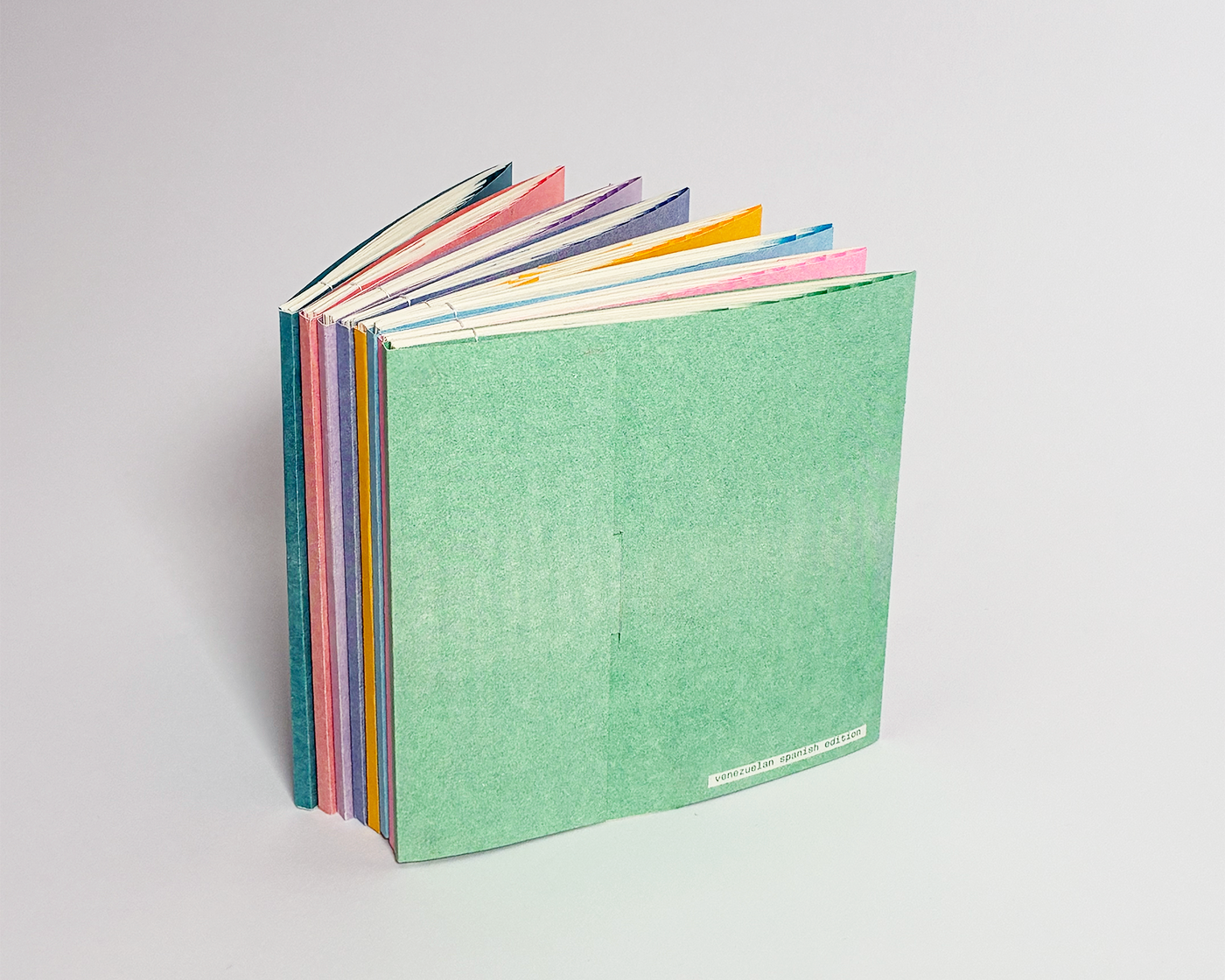
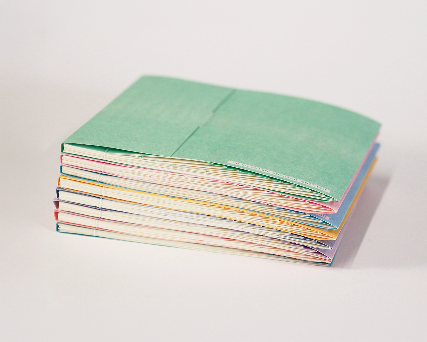
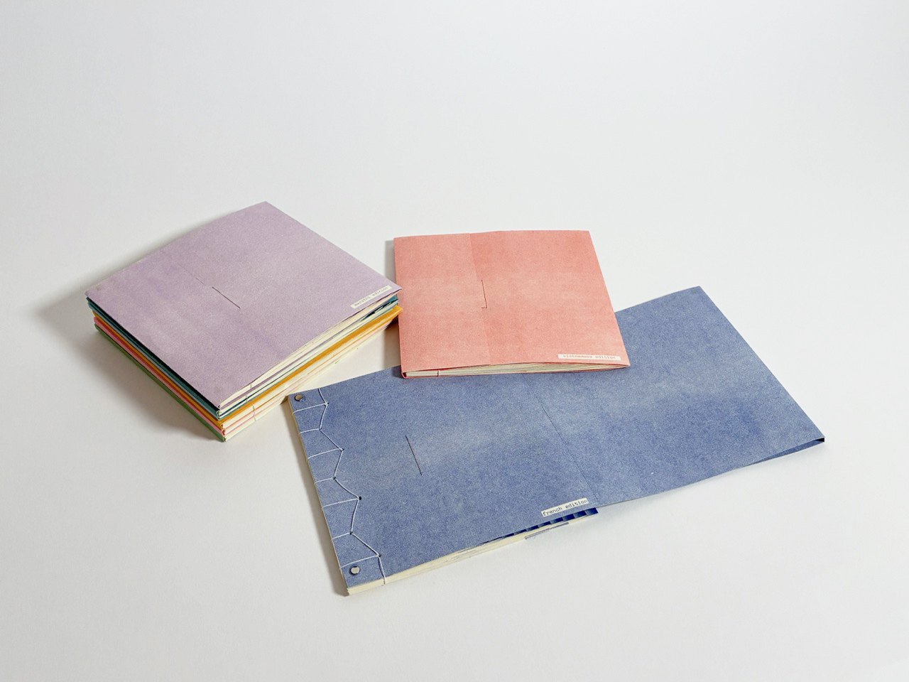
Realizing that slangs are culturally specific and collectively authored, I decided to open the project to more languages. Each volume represents a different linguistic context, using a single riso spot color as a coding system. While typography remains consistent across the series, color becomes the signifier for each language.
To signal Atlas as a whole, ever-growing object, magnets were embedded within the covers to allow each book to physically connect. When stacked, the volumes align into a large object, transforming the series into a modular archive of evolving language. Rather than a fixed publication, Atlas becomes a system that can continue to grow, adapt, and accumulate new voices over time.
Atlas
“How can living languages be captured in a fixed form?”
—Duration: 1 month
—Scope: Editorial Design, Book Binding
—Tools: Indesign, Photoshop, lots of crafting
Atlas is an ever-growing series of riso-printed books, mapping the living edges of language: slangs, inside jokes, and internet-born phrases.
The series was inspired by traditional glossaries, which often prioritize density, compressing language into static forms that can’t keep pace with how languages evolve. Atlas was created to push back that notion by pairing each slang with collaged imagery that interprets words at their most literal and absurd form.
Each volume is hand-sewn using Japanese stab binding and embedded with magnets, allowing the series to physically connect and evolve.
Process
Initial Ideas
Atlas began as a single book, in response to a prompt: make a book about code. Instead of approaching code as syntax, the project expored slangs as coded messages. These expressions rarely describe meanings directly, but operate through distortion and shared context.
To explore this, each phrase was translated into its more literal and absurd visual form through collages. Existing stock photos were cut and reassembled to make strange but interesting imagery.
Design & Prototype
Japanese stab binding was chosen to conceal content between layers. Risograph introduced texture, misregistration, and saturated colors, reinforcing the playfulness of imagery. The staircase structure was created as a spatial metaphor for layers of language.
With this binding structure, each page brings a layered reading experience: the literal interpretation appears first, followed by its literal visual, then the actual meaning is tucked deep within the page. The publication intentionally avoids a grid system. Instead of imposing order, elements are allowed to float on the page to reflect the unstructured nature of contemporary language.
Expansion
Realizing that slangs are culturally specific and collectively authored, I decided to open the project to more languages. Each volume represents a different linguistic context, using a single riso spot color as a coding system. While typography remains consistent across the series, color becomes the signifier for each language.
To signal Atlas as a whole, ever-growing object, magnets were embedded within the covers to allow each book to physically connect. When stacked, the volumes align into a large object, transforming the series into a modular archive of evolving language. Rather than a fixed publication, Atlas becomes a system that can continue to grow, adapt, and accumulate new voices over time.
Atlas
“How can living languages be captured
in a fixed form?”
—Duration: 1 month
—Scope: Editorial Design, Book Binding
—Tools: Indesign, Photoshop, lots of crafting
Atlas is an ever-growing series of riso-printed books, mapping the living edges of language: slangs, inside jokes, and internet-born phrases.
The series was inspired by traditional glossaries, which often prioritize density, compressing language into static forms that can’t keep pace with how languages evolve. Atlas was created to push back that notion by pairing each slang with collaged imagery that interprets words at their most literal and absurd form.
Each volume is hand-sewn using Japanese stab binding and embedded with magnets, allowing the series to physically connect and evolve.
Process
Initial Ideas
Atlas began as a single book, in response to a prompt: make a book about code. Instead of approaching code as syntax, the project expored slangs as coded messages. These expressions rarely describe meanings directly, but operate through distortion and shared context.
To explore this, each phrase was translated into its more literal and absurd visual form through collages. Existing stock photos were cut and reassembled to make strange but interesting imagery.
Design & Prototype
Japanese stab binding was chosen to conceal content between layers. Risograph introduced texture, misregistration, and saturated colors, reinforcing the playfulness of imagery. The staircase structure was created as a spatial metaphor for layers of language.
With this binding structure, each page brings a layered reading experience: the literal interpretation appears first, followed by its literal visual, then the actual meaning is tucked deep within the page. The publication intentionally avoids a grid system. Instead of imposing order, elements are allowed to float on the page to reflect the unstructured nature of contemporary language.
Expansion
Realizing that slangs are culturally specific and collectively authored, I decided to open the project to more languages. Each volume represents a different linguistic context, using a single riso spot color as a coding system. While typography remains consistent across the series, color becomes the signifier for each language.
To signal Atlas as a whole, ever-growing object, magnets were embedded within the covers to allow each book to physically connect. When stacked, the volumes align into a large object, transforming the series into a modular archive of evolving language. Rather than a fixed publication, Atlas becomes a system that can continue to grow, adapt, and accumulate new voices over time.